Monday, January 29, 2007

Assignment #5 - Your True Colors


Deadline: February 7, 2007
Value: 5%


Color combinations tend to evoke certain reactions based upon cultural and personal experience. Being aware of your senses, memories and experiences helps you to create colour combinations that tell a story. That's what excellent color design strives for: palettes that tell a story.

Use the template and text provided online to construct 6 color palettes. You're permitted to use your choice of colors, but do so within your interpretation of each theme:
1. The colors of Southern Alberta
2. The colors of my body
3. The colors of my favourite scent, perfume or cologne
4. The colors of my favourite fruits
5. My favourite colors
6. The colors of my favourite memory

Give the CMYK and RGB values for each color, and a name which evokes their color personalities. Choose a Subordinate or Base Color, a Dominant Color and two Accent or Highlight Colors.

Deliverables:
(2) Two 8.5” x 11” color prints (cardstock or photo paper), labelled appropriately with your name.
Please follow the template exactly.

Evaluation will be based upon the following criteria:

• Has the student followed the assignment directions?
• Do the color palettes reflect an understanding of the principles explored in the class sessions?
• Is the assignment professionally printed and presented?

Click here to download an example of the assignment in Illustrator format.

Click here to download page 1 of the assignment template.
Click here to download page 2 of the assignment template.

The Hyphen, the En Dash and the Em Dash.


As a professional designer, you must know the difference between the hyphen, and the en and em dashes. While this article is written for web design, it is equally true for print design.

Click here to read about hyphens and dashes.

2007 Color Trends

Come and meet the mood-evoking personalities of today's color palettes. Images and text from Sherwin Williams. Click on subtitle to read more, and use the online color palette generator.

Balanced Living Color Trend Palette

There's nothing black and white about green. The renewed appreciation for a balanced, healthy lifestyle is evident in organic living and mindbody workouts. Natural fibers, recycled materials, simple furnishings - these are just a few of the touches to create balanced living.

Sultry Origins

From the fashions of Beverly Hills to the street couture of New York City, global ethnic influences are turning up everywhere. Bold, spice-infused colors. Intricate handcrafted quality. Clean, simple lines. A distinctive, Old World feel - these express the essence of sultry origins.

Understated Elegance

Today's neutral palettes are sophisticated. Warm tones blend with cool. Natural materials add depth and character. A pendant lamp adds luster to textures and finishes. Artisan pottery compliments exquisite furniture. It's luxury made affordable. Understated elegance for all.

Virtual Re-mix

Nostalgia is booming. It's the integration of past and present, the visual equivalent of a greatest hits CD, a tendency to mix rather than match. You can see it in all things retro and vintage, from a '60s pattern on a bathroom mat to a claw-foot tub that harkens back to days gone by.

Kinetic Contrasts

Look to fashion and advertising and you will see the impact of kinetic contrasts. It pulsates with energy and style. Intense color accents, spare minimalist backgrounds, geometrically shaped furniture and contemporary art help create this wow factor.

Pantone Designer Paint Colors 2007
When we asked the designers to translate their spring 2007 fashion colors to interior paint colors and describe the room, this is what they said:


Pantone Spring 2007 color trends

Click on subtitle to read more.

More Color Trends 2007

Fashion Trendsetter, online fashion and color forecasting website today announced the release of the Spring/Summer 2008 color trends as two editions; Vol.II and Vol.III. For the summer 2008, two different stories and four sub trend cards are prepared for each color trends... Click on subtitle to read more.

Thursday, January 25, 2007

Tricks for Copying Anything off the Web

1. PRINT SCREEN
Here's a technique that probably no one ever told you. Sometimes web sites try to protect their content by barring you from right clicking and downloading their images. Here's how get around this problem.

With the web site on your screen, press CTRL, SHIFT and PRINT SCREEN on your key board. Your computer has just copied what you see on screen and put it on your paste board.


Now open up Photoshop, to go FILE pulldown menu, select NEW, create a new document (the size will automatically be set up correctly), then PASTE. You will see the image in your Photoshop document. Now you can crop it, select areas and copy, etc.


Mac users often have a program called "Capture" that allows you to do the same thing (just a little easier).

Use wisely - don't forget there are copyright laws and protections.

2. Using Internet Explorer to Download a Web Page
With the web site showing in your browser, go to FILE, SAVE AS, and select "Save as Type: Web Page, complete." The html file and a folder with the images will download. Now you can open up the web page with Dreamweaver, and study how it was constructed.

Wednesday, January 24, 2007

Assignment #4 - Typographical Hierarchies


Deadline: January 31, 2007
Value: 5%
Assignment #4: Typographical Hierarchies

When working with text as a designer, it's your challenge to take text and develop a hierarchical system using typographical and layout options, in order to make the page legible and increase readability. Order and divide the elements of text which include:
• a headline
• a byline (i.e. author of article)
• call out text
• subheads
• body copy.
Arrange them appropriately and in terms of importance so that the reader's eyes are guided through the composition by design.

Use the template and text provided online to construct 5 compositions. You're permitted to use your choice of font, but use it consistently in each composition. As well, you have the option of varying spacing, adding indents and rules (lines).
1. Single font, no change in point size
2. Single font, variable point size
3. Single font, variable weight
4. Single font, variable style (upper case, all lower case, or upper and lower case, italic, underlined
5. Any combination of the above.

Deliverables:
(5) Five 8.5” x 11” black and white prints (cardstock or photo paper), labelled appropriately with your name. Please follow the template explicity.

Evaluation will be based upon the following criteria:
• Has the student followed the assignment directions?
• Do the compositions reflect an understanding of the principles of typographical hierarchies and layout explored in the class sessions?
• Is the assignment professionally printed and presented?

Click here to download an MS Word document of Assignment #4.

Click here to download an Illustrator template for Assignment #4.

Monday, January 22, 2007

Type Gallery


Check out the Type Gallery for some inspirational approaches to the art of typography.

Assignment #3: Graphic Primitives


NMED 2005 – Design Fundamentals for New Media
Instructor: Michael Jorgensen
Deadline: Monday, January 29, 2007
Value: 5%

Create a series of compositions exploring contrast and balance. Use only circles, then rectangles, then triangles to produce 3 separate studies. Each page will be divided into 4 frames expressing the following:
• High contrast
• Low contrast
• Symmetrical balance
• Asymmetrical balance

Use as many or as few shapes as you wish. Do not mix shapes. Use only black and white (no greyscale values or colour or gradient fills).

Deliverables:
(3) Three 8.5” x 11” black and white prints (cardstock or photo paper), labelled appropriately with your name.
Upload to your blog journal as a jpg or gif.

Evaluation will be based upon the following criteria:• Has the student followed the assignment directions?
• Is there an interesting selection of subject matter?
• Do the compositions reflect an understanding of the principles explored in the class sessions?
• Do the separate compositions relate to one another on the page in a pleasing manner?
• Is the assignment professionally printed and presented?

Click here to download an MS Word document of Assignment #3.

Click here to download an Illustrator template for you to use. Make sure you save one orginal version, then resave it three times - one for circles, rectangles and triangles.

The Fine Print: Typographical Hierarchies

Click here to view powerpoint slides. Notes are copyright and courtesy of Prof. Christopher Moore.

Click here to read A Brief History of Type.

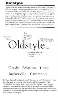
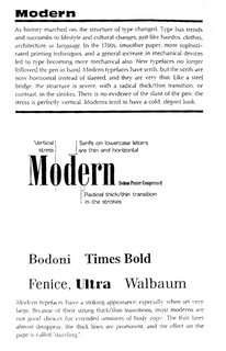
Categories of Type


Oldstyle


Slab Serif


Modern


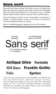
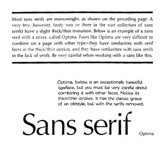
San Serif


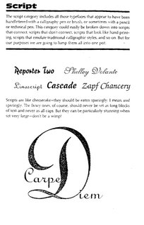
Script


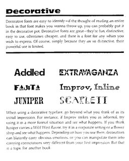
Decorative


Bitmapped Fonts

A bitmap font is one that stores each glyph as an array of pixels (that is, a bitmap). It is less commonly known as a raster font. Bitmapped fonts are particularly useful for small type in digital media when used as a gif or jpg image on web sites or in flash animation, because they do not require rastering for the curves as with standard typefaces. Since the characters are made up of square pixels, the typefaces do not look blurry at small sizes and remain sharp appearing.


The Point System
Points
• 72 points (pts.) to the inch in height, 36pts = 1/2", 18 pts = 1/4”
• used for measuring type size
• refers to the height of the capital letters

General Rules
• do not use more than 2 typefaces in an ad or document
• do not use more than 1 headline face or body copy face
• the types you use should be either very similar (harmony) or very dissimilar (contrast)
• for readability, headlines are often sans-serif and body text is serif, avoid all caps, and use even spacing
• the bigger the type face, the wider the column
• 39 characters of lowercase letters, break long portions of text into columns
• flush left is usually easier to read because letter spacing is more even
• fully justified is often used in books and newspapers
• flush right is usually used for small portions of text
• never ad extra kerning to copy - only use kerning on short headlines or subheadlines of one or two words
• avoid punctuation in headlines
• avoid capitalizing each word in headlines - only capitalize the first word or proper names
• using all lower case on headlines and subheads associates the company or product with creativity
• be careful with word emphasis and end of lines
• the negative letter space is important to appearance and readability

Orphans and Widows: Finetuning

Do you leave readers dangling? Words left hanging leave readers in the dark. In desktop publishing, widows and orphans are those words or short phrases at the end or beginning of paragraphs that are left to sit alone at the top or bottom of a column — separated from the rest of the paragraph.
Click here to read the rest of the article by Jacci Howard Bear from About.com.

Finetuning
• reduce kerning up to -2 pts using the tracking option in a paragraph
• reduce width of text by up to 90% - preferably as little as possible

Thursday, January 18, 2007

Online Illustrator Tutorials


There are some free Adobe Illustrator tutorials available online. Click here to view.

The free tutorials include:
Introduction
What is Illustrator? (02:49)
What is New in CS2? (04:14)
What are Vector Graphics? (03:34)
A Tour of the Interface (05:00)
Managing Palettes (05:10)
Getting Assistance (04:54)
Resetting Preferences (04:16)
Working with Documents
Creating a New Document (04:28)
Using Document Setup (04:03)
Saving Native Format (04:29)
Saving EPS and Templates (04:55)
Exporting (04:37)
Saving for Web (05:00)
Printing Fundamentals (04:39)
Drawing Fundamentals
Drawing/Selecting/Scaling (03:50)
Stroke/Fill/Color Basics (04:36)
Stacking Order and Layers

Here are a few more online Illustrator Tutorials - check them out. Click here to visit site.

Intro
Intro Demo
What's New Demo
Vector vs. Raster Demo
Artboard Demo
Menu / Window Basics Demo
Navigating Palettes Demo
Tools Palette Demo

Pen Tool Techniques
Pen Tool / Anchor Points Demo
Creating Basic Shapes Demo
Direction Lines / Handles Demo
Convert Anchor Point Tool Demo
Finishing and Selecting Paths Demo
Direct Selection Tool Demo

Basic Concepts & Techniques
Selecting Objects Demo
Lasso Tool Demo
Assigning Fill and Stroke Demo
Assigning Colors Demo
Preferences Demo
Keyboard Shortcuts Demo
Stacking Order Demo
Group Selection Tool Demo
Magic Wand Tool Demo
Bounding Box Demo

In addition, you can do a google search for "online Illustrator tutorials" and find several other sites with excellent information.

Monday, January 15, 2007

Room to Breathe: Whitespace, Contrast + Balance


Click here to read notes on Whitespace, Contrast + Balance.
Notes are copyright and courtesy of Prof. Christopher Moore

Click here to see examples of print ads that employ white space techniques.

Sunday, January 14, 2007

New Media News: Apple Introduces Revolutionary Phone


It's a widescreen iPod, mobile phone, and "internet communicator" all in one using a touchscreen navigation. Only one button, the home button. Thinner than any smartphone. Comes with full-featured internet browser, integrated Google search and maps, free Yahoo push IMAP email (like BlackBerry), runs OSX, widgets. Shipping in June in $499 and $599 models, exclusively with Cingular.

Friday, January 12, 2007

Assignment #2: Composing with the Camera

Value: 5%
Duration: One Week
Due: January 22


For this assignment you are asked to use the camera view-finder as a compositional tool. Rather than beginning from scratch with a blank page, you will capture and edit imagery from the world around you. Taking into consideration the classical means of spatial division presented in the class session, select architectural details, abstracted 3D forms and/or corners of rooms as your subject matter. Please avoid recognizable objects, and focus on geometrical (preferably linear) forms. You should have approximately 10 digital images saved and available to work with during the lab session.


From these initial photos, select four of your favourite compositions to work with. Using the Adobe Illustrator template (provided online on our course blog), place and scale your images to fit within the 4 frames. Modify the title information with your name and personal information. Create a new layer and lock the previous two. Using the pen tool, trace the forms in your photographs, eliminating details and embellishing others, until you have a strong composition. You may want to crop, scale, or shift your reference photo to achieve a particular layout. Modify the fill colours for each form, using only greyscale values.


Once you are pleased with your design, delete or hide the layer with the photographic source. Save the file as a .pdf, and have the document printed in black and white on 8.5”x11” cardstock or photo paper (this can be done at the Copy Centre on level 6).

Deliverables:
- 8.5”x11” black and white print on cardstock or photo paper (labeled
appropriately)
- save for web as a jpg, and upload image to your blog journal
- please be prepared to present your work during the following class session

Evaluation will be based upon the following criteria:

- Has the student followed the assignment directions?
- Is there an interesting selection of subject matter?
- Do the compositions reflect an understanding of the principles explored in the class sessions?
- Do the separate compositions relate to one another on the page in a pleasing manner?

Click here to download the Adobe Illustrator Template.

Click here to download a PDF of detailed instructions.
Wednesday, January 10, 2007

What the hell is the Fibonacci Sequence?


Click here to view an excellent flash animation how the Fibonacci Sequence works, and is related to the spiral and golden mean.

Textbook & Readings

Make sure that you purchase the correct textbook for NMED 2005 (in the bookstore it's in the wrong section). It looks like this:


The Elements of Graphic Design: Space, Unity, Page Architecture, and Type

Please read Introduction, Chapter one for Monday, January 15, 2007.

Golden Proportion In-class Exercise


Here's some guidelines for doing this in-class exercise on golden proportion and the principle of thirds.

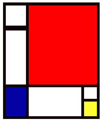
What artist does this remind you of?


Piet Mondrian.

Assignment #1 - Data.Body | Blog Journal

ASSIGNMENT #1: DATA.BODY
VALUE: 0%
DURATION: One week
DUE: January 15

Your first assignment is create your own blog journal, and to provide the instructor and the rest of the class with information related to your interests, goals, and media preferences. Please refer to class handout for more details.

Please use Blogger to create your own blog journal and upload your data.body onto it.

Once you've completed Assignment #1, please send me an email with your blog journal address (URL) and I will put it on our course blog.

The World is Flat: Points, Lines & Planes


Click here for notes on "The World is Flat: Points, Lines & Planes."

The notes are courtesy, and copyright, of Prof. Christopher Moore.