Click here to read A Brief History of Type.
Categories of Type
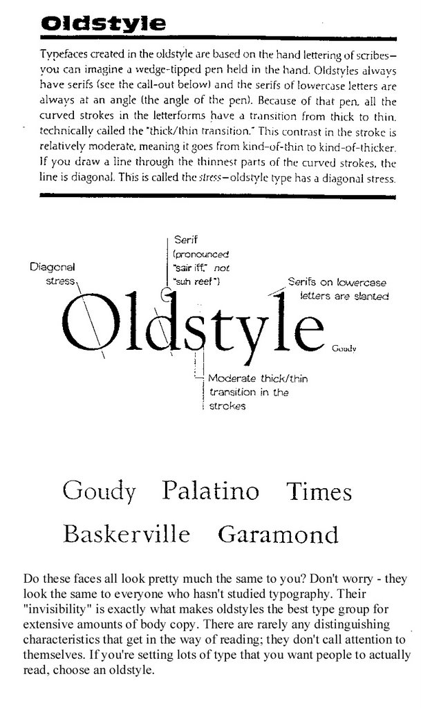
Oldstyle
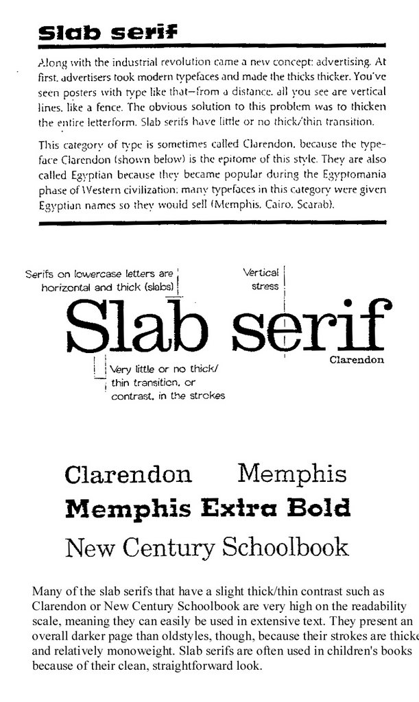
Slab Serif

Modern


San Serif
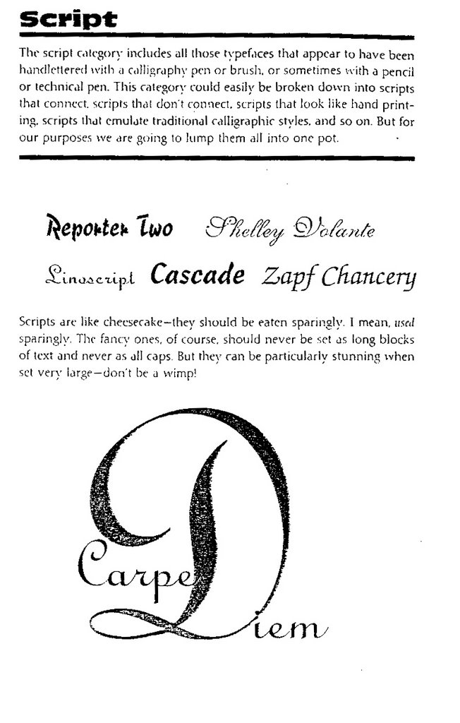
Script
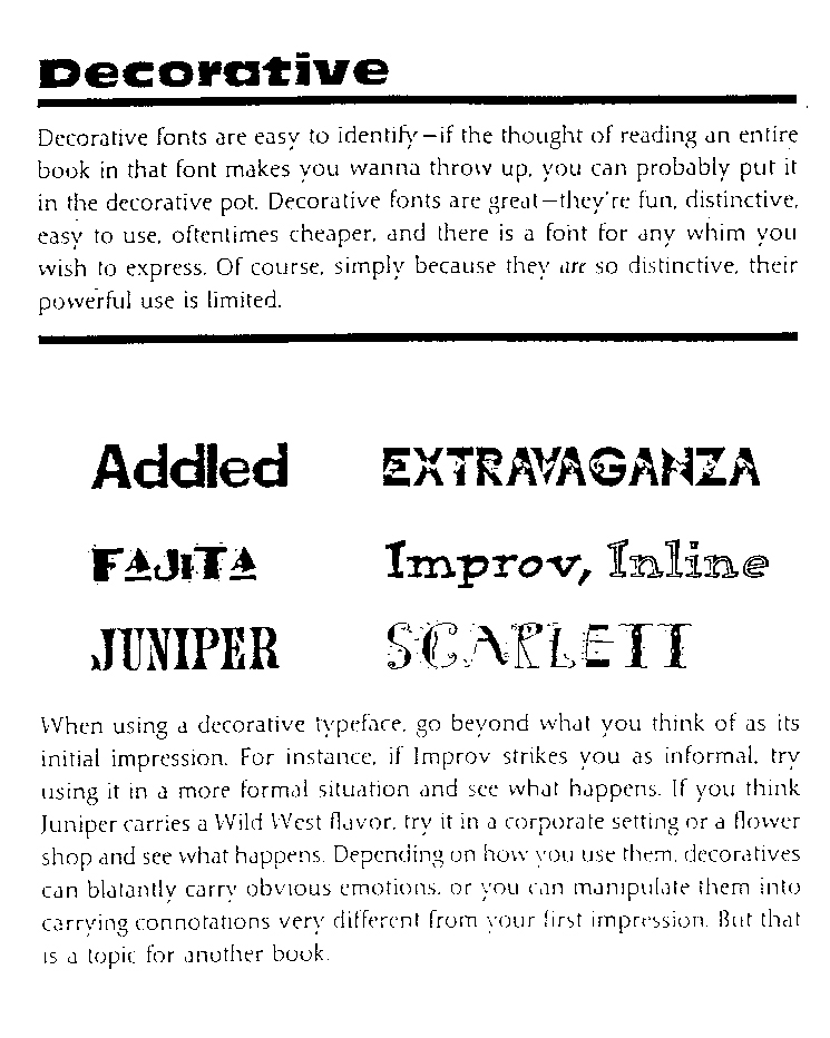
Decorative

Bitmapped Fonts
A bitmap font is one that stores each glyph as an array of pixels (that is, a bitmap). It is less commonly known as a raster font. Bitmapped fonts are particularly useful for small type in digital media when used as a gif or jpg image on web sites or in flash animation, because they do not require rastering for the curves as with standard typefaces. Since the characters are made up of square pixels, the typefaces do not look blurry at small sizes and remain sharp appearing.

The Point System
Points
• 72 points (pts.) to the inch in height, 36pts = 1/2", 18 pts = 1/4”
• used for measuring type size
• refers to the height of the capital letters
General Rules
• do not use more than 2 typefaces in an ad or document
• do not use more than 1 headline face or body copy face
• the types you use should be either very similar (harmony) or very dissimilar (contrast)
• for readability, headlines are often sans-serif and body text is serif, avoid all caps, and use even spacing
• the bigger the type face, the wider the column
• 39 characters of lowercase letters, break long portions of text into columns
• flush left is usually easier to read because letter spacing is more even
• fully justified is often used in books and newspapers
• flush right is usually used for small portions of text
• never ad extra kerning to copy - only use kerning on short headlines or subheadlines of one or two words
• avoid punctuation in headlines
• avoid capitalizing each word in headlines - only capitalize the first word or proper names
• using all lower case on headlines and subheads associates the company or product with creativity
• be careful with word emphasis and end of lines
• the negative letter space is important to appearance and readability
Orphans and Widows: Finetuning

Do you leave readers dangling? Words left hanging leave readers in the dark. In desktop publishing, widows and orphans are those words or short phrases at the end or beginning of paragraphs that are left to sit alone at the top or bottom of a column — separated from the rest of the paragraph.
Click here to read the rest of the article by Jacci Howard Bear from About.com.
Finetuning
• reduce kerning up to -2 pts using the tracking option in a paragraph
• reduce width of text by up to 90% - preferably as little as possible
No comments:
Post a Comment